So ist das Leben eben!
2018年10月23日星期二
Lorenzo Mattotti: ILLUSTRATIONS
Lorenzo Mattotti: ILLUSTRATIONS: © Lorenzo Mattotti © Lorenzo Mattotti © Lorenzo Mattotti © Lorenzo Mattotti © Lor...
2017年6月2日星期五
FW:Coralie Bickford-Smith, The Fox and the Star
https://www.we-heart.com/2016/11/09/coralie-bickford-smith-the-fox-and-the-star/
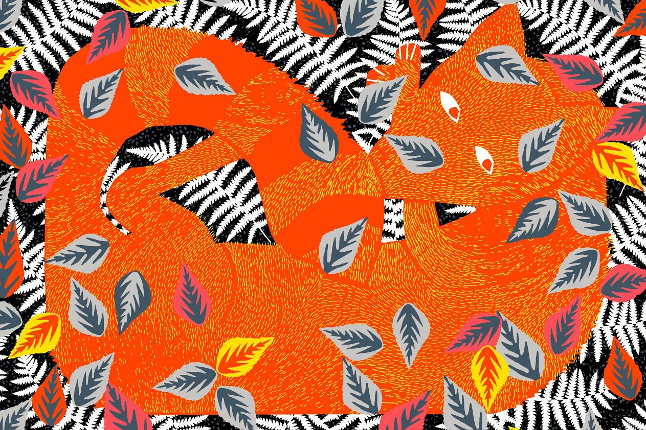
Spread from The Fox and the Star © Coralie Bickford-Smith
Coralie Bickford-Smith, The Fox and the Star
Fascinating exhibition lays bare the working process behind Coralie Bickford-Smith's instant classic...
Francesca Soler • 9 November, 2016
‘I started by putting ideas down onto paper and thinking about how words and visuals could work together to tell my story.’ Begins Coralie Bickford-Smith, of her preliminary sketches for Fox; the protagonist in the writer/illustrator’s debut children’s book, The Fox and the Star.
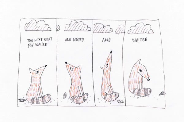
First sketches of Fox © Coralie Bickford-Smith
They are the starting point of a new exhibition, opening today, that documents the process behind the instant classic. Crowned Waterstones Book of the Year 2015, The Fox and the Star has been widely regarded as one of the finest illustrated children’s books of all time, winning accolades the world over for its visuals, story, and embracing of the ‘classic fable’ approach.
Indeed, it harks back to the visual language of William Morris and William Blake, their storytelling and aesthetics a key influence for Bickford-Smith: ‘Morris’s design work on the Kelmscott Press has been an inspiration throughout my career designing book covers for Penguin, and took on a renewed relevance when embarking upon the illustration of my own debut story,’ she explains, referencing her position as in-house cover-designer at Penguin Books.
Fittingly, the exhibition is showing at the only public gallery devoted to the designer, craftsman and radical socialist. ‘His attention to detail and gift for pattern is celebrated in the permanent collections of the William Morris Gallery,’ Bickford-Smith continues, ‘who work to inspire and inform people of his legacy. I hope that visitors to the exhibition will use the opportunity to engage with Morris’s work and discover the enduring relevance of his ideas.’
A fascinating insight into the workings of a creative whose work is positioning her alongside the greats she so admires, The Fox and the Star continues at William Morris Gallery till 29 January.
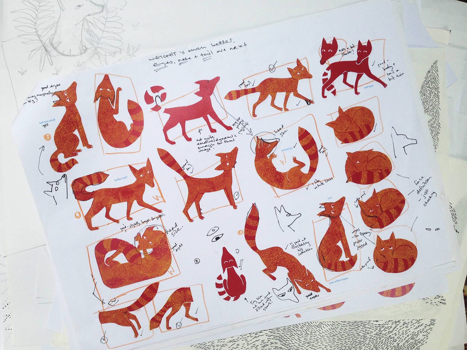
Roughs of the Fox from Coralie Bickford-Smith’s sketchbook.
© Coralie Bickford-Smith
© Coralie Bickford-Smith
‘I developed the fox character and gathered all the individual drawings on one page to check that he was consistent throughout the book. These are all ready for final printing as I also design the book and produce the artwork so that it is ready to go on press. I had to make sure that all the fox fur illustrations would print correctly so doing overviews like this was very useful.’
– Coralie Bickford-Smith
– Coralie Bickford-Smith
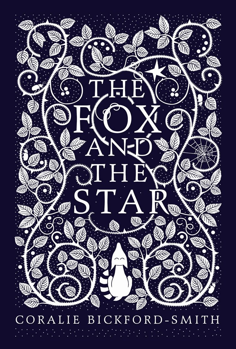
The hardback cover design for The Fox and the Star
© Coralie Bickford-Smith
© Coralie Bickford-Smith
‘The cover of the hardback of The Fox and the Star was bound in beautiful cloth and stamped with a foil. Much of my work harks back to the beautiful bookbindings from the Victorian era. Books should be loved and treasured and passed down through generations.’
– Coralie Bickford-Smith
– Coralie Bickford-Smith
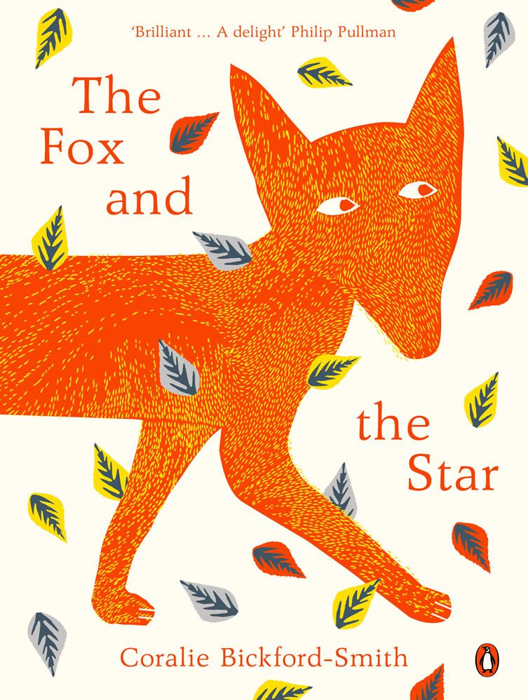
The paperback cover design for The Fox and the Star
© Coralie Bickford-Smith
© Coralie Bickford-Smith
‘The paperback is bigger and has full-bleed images. We have created a more child friendly book this time but which has the same lovely paper and orange coloured thread binding the book together.’
– Coralie Bickford-Smith
– Coralie Bickford-Smith
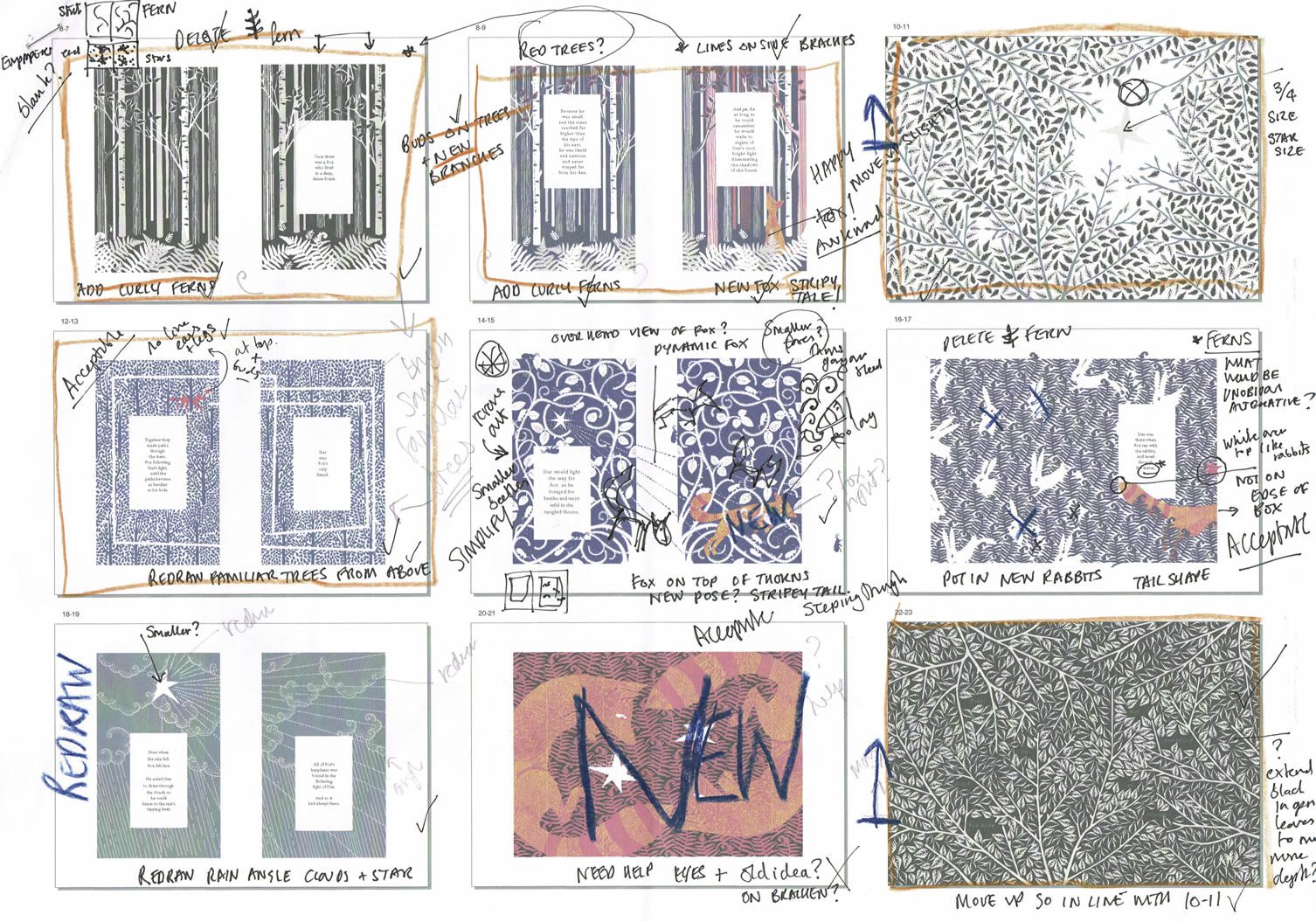
Layouts for The Fox and the Star
© Coralie Bickford-Smith
© Coralie Bickford-Smith
‘Pacing the use of colour throughout the book was really vital to the flow of the story,
so this has to be taken into consideration by over viewing the whole book on one page.’
– Coralie Bickford-Smith
so this has to be taken into consideration by over viewing the whole book on one page.’
– Coralie Bickford-Smith
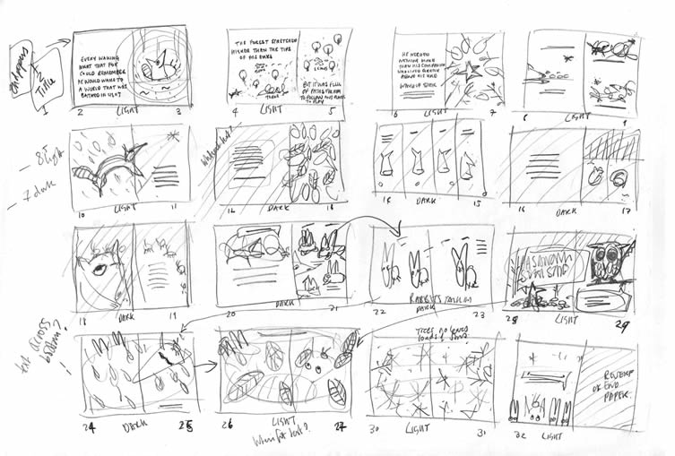
Rough storyboarding for The Fox and the Star
© Coralie Bickford-Smith
© Coralie Bickford-Smith
‘There was much story boarding that took place to work out the pace and the flow of the words and images. Lots of ideas get left behind in an attempt to simplify and communicate the most vital elements.’
– Coralie Bickford-Smith
– Coralie Bickford-Smith
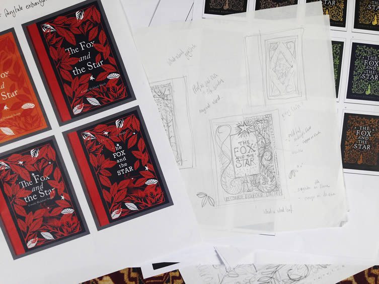
Cover roughs for The Fox and the Star
© Coralie Bickford-Smith
© Coralie Bickford-Smith
‘When designing the cover it goes through many different stages. The first ideas are a playful exploration of possibilities.’
– Coralie Bickford-Smith
– Coralie Bickford-Smith
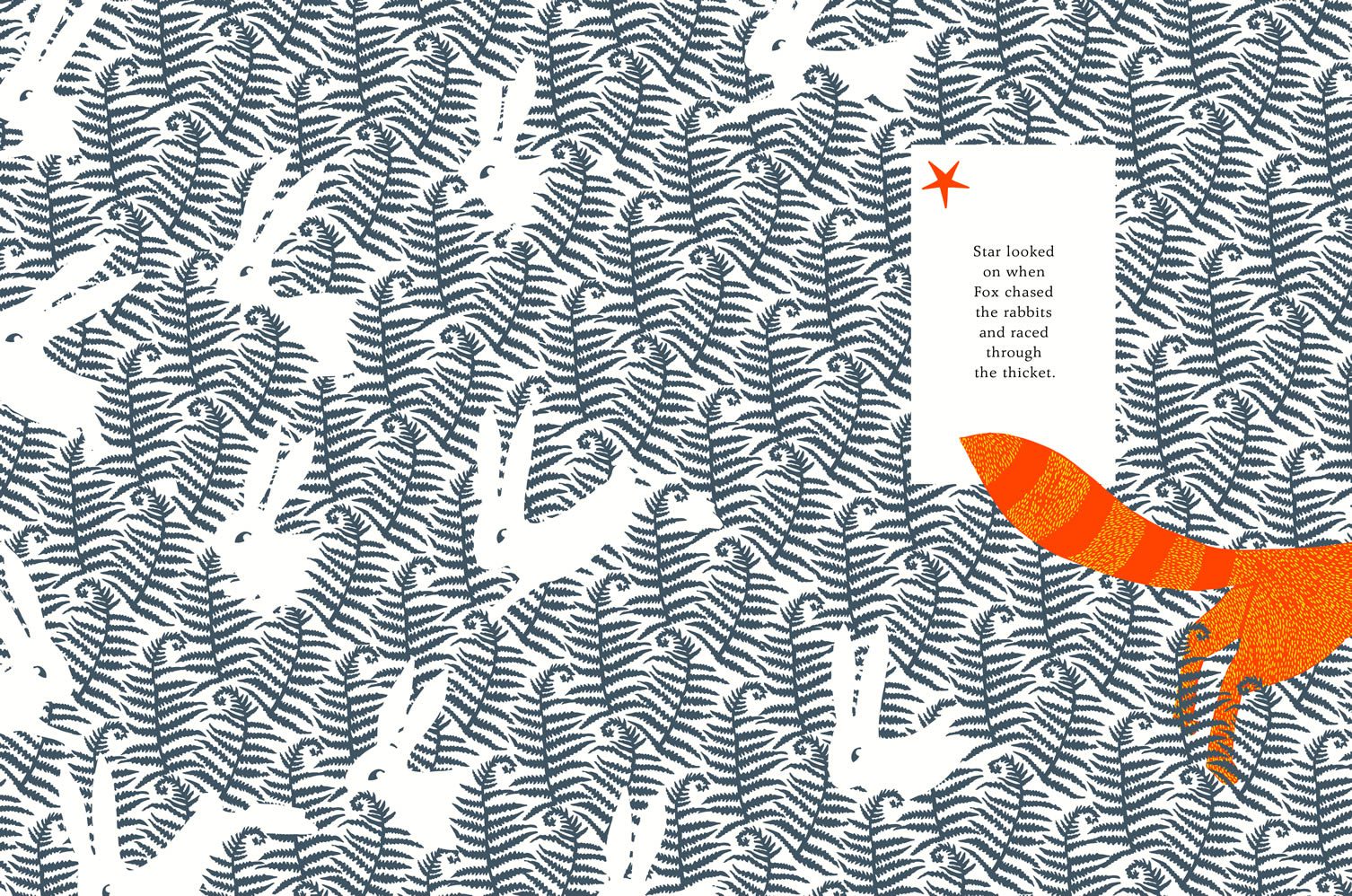
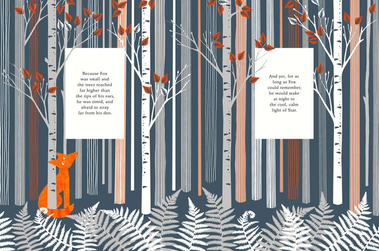
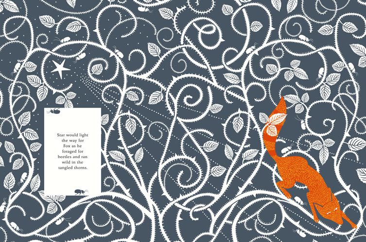
Spreads from The Fox and the Star © Coralie Bickford-Smith
2017年5月27日星期六
2017年3月12日星期日
2017年2月15日星期三
Notes from VP talk 20170215
The Blueprint from Wednesday on Vimeo.
What inspired me most from works of this studio was the transitional shots (transfiguration) in storytelling and relationships btw. sounds (text) and video.
Website: http://www.wearewednesday.com
2017年2月3日星期五
Course Project Journal 7: Model-making
In the past few weeks I was doing the storyboarding about a girl growing up in an attic and meanwhile making an model in order to draw from it. This making finally turned out to be a scene I intended to make detailed and made an experimentation with in communicating extension of space.
The original rough model I made. I was given some suggetions about thinking over the special and personal meanings of the objects and scenes I made in an group tutorial.
The rough figure sculpture. Those would be my protagonists.
I was thinking over the idea of classification of stuffs, life under a low roof etc.
Then I decided to make a more detailed model and see what would happen next and started to make a more organized plan, calculating the size of every facade, measuring and planning the length of roof edges, which was unfortunately a complicated mathematical problem that almost killed me...
My idea was the outside facades should be real looks of a house and the inside space could be infinitive... from sky with clouds to cosmos...
I lasercut some circles, at first aiming to make a rising round stage in the middle of the model, but later I found it could be made into an extention of the space... The figures didn't have to stay in the midst of the model, but they could still be inside that space.
Figures made of light clay
I made a bed and a bedside cabinets to emphasize that this was a scene of a bedroom, a private relaxing space where a child was living and growing, with some cardboard boxes to imply this was used as a storeroom as well. My original idea was to mix the surfaces of these furniture with the background of the starred sky as if they were merged, but the colours didn't match well, which could mean a failure in this communication part.
Some problems I later found when doing the interim presentation:
- The underlined part should be the "stage" as the photo above, but the model was positioned so frontal due to the given space that the stage was margnialized into the corner.
- The failure in the communicative function of the infinitive space inside. Maybe I need to repaint the bed and the cabinet to make them merge better in the surrounding and stick or hang some cotton in the model as clouds, in order to break the boundaries between fantasy and reality further.
- A larger circle as the top layer of the stage to emphasize the meaning?
- Maybe a same blue sky painting for the basement?
2017年1月27日星期五
Course Project Journal 6: Chaotic Storyboarding
Based on some notes and inspirations from the last Brautigan Library workshop about artist books...
I developed my own collections of books in a personal order...
and tried to find a narrative of a girl growing up while playing in her imaginative world.. and refining the text, and am still considering over the relationship between texts and images, the blank meaning space that could possibly be left...
订阅:
评论 (Atom)


